Teacher Evaluation Platform

The Teacher Evaluation Platform enables Observers to assess the performance of public school teachers and students on a bi-annual basis. This platform not only facilitates observations, but also allows school-based facilitators to set objectives after the observation, track progress, conduct surveys, and reflect on the year's outcome.
In this Case Study I will guide you through my process and highlight my collaboration with a cross-functional team.  

Project Overview
Re-developing existing evaluation platform and suggest better UX Design along with refreshing the backend development. The objective is to create a more user-friendly interface, streamline the evaluation process, and provide a seamless experience for teachers and evaluators.
‍My Contribution
As a UX designer I played leading role in redesigning a teacher evaluation platform, responsible for conducting user research, creating wireframes and prototypes, conducting Usability Testing, measuring the UX KPIs. Worked closely with the development team to ensure a seamless implementation.

Duration

  1. User Research 6 wks
  2. UX Design of 2 Modules 11 wks
  3. 2 rounds of User Testings 2 wks
  4. Development 10 wks

Team

1. UX Design/Research

2. PM

3. Developers/Software Architecture

4.IT Specialist

Scope

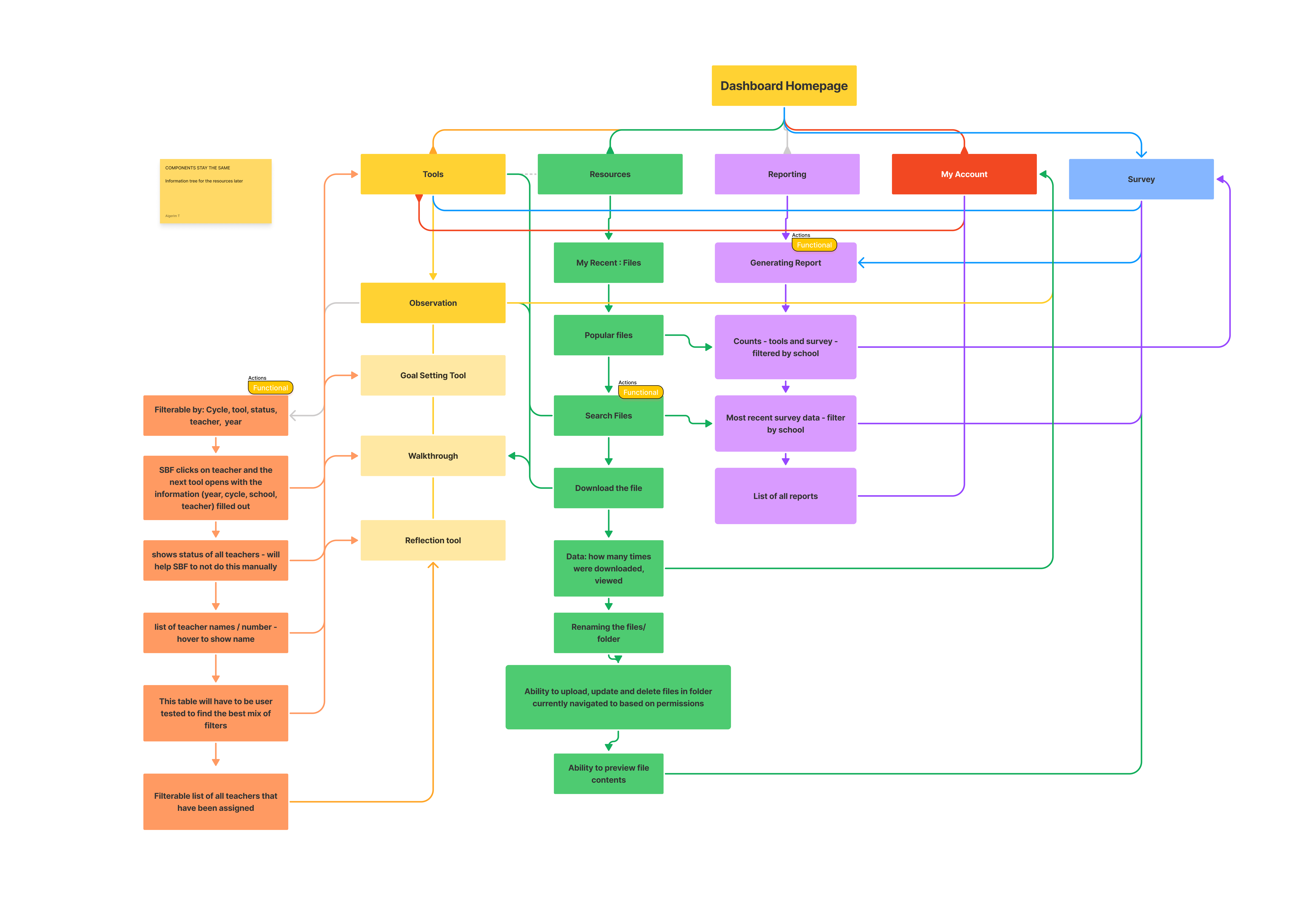
This project scope is developing and implementing 5 main modules of  evaluation platform. Any additional improvements outside of this scope will not be included in this project.

The problem

Observers are currently facing a significant challenges in completing the largest observation tool in the platform, due to a lack of intuitive filtering features, seamless user flow and poor UI. This makes it for evaluators difficult to find the specific teacher they need to evaluate, leading to a time-consuming and cumbersome evaluation process.

35%

According to the Stakeholders and User interviews 35% Observers who used this platform, quit their job because of the platform.

167h

Training time of the new observers took 167h it is 110% more than the regular given time.

78%

78% of the Error rate in multiple tasks with 6 participants

Goal

How can we improve UX flow of the Observation tool by providing intuitive UI/UX Design?
Design Online and Offline mode for the dashboard: Observers are travelling to the Northern cities of the Province where network is not enough to maintain quality connection with a server. One of the main Business needs was to design Offline and Online mode of the Dashboard, inform the user when Observer about to activate offline mode.

Improve user flow: The platform can streamline the evaluation process by simplifying the steps involved and reducing the number of clicks required to complete an evaluation.

Language and privacy: The content and language for this dashboard need special approach. While platform was about to evaluate we can not give any level or score to the Teacher and student. Content need to discreet while using each tool. Teacher can not see what Observer typied and still they need to sit together to go through what needs to be improved from the teacher's POV.

Deliverables: Time to completion on Observation process flow is decreased by 25%.
65% of users or more complete the defined path as expected.
Our new designs perform better against the previous version on all KPIs.

What is main challenge for Observers

RESEARCH

Confusion around stored data

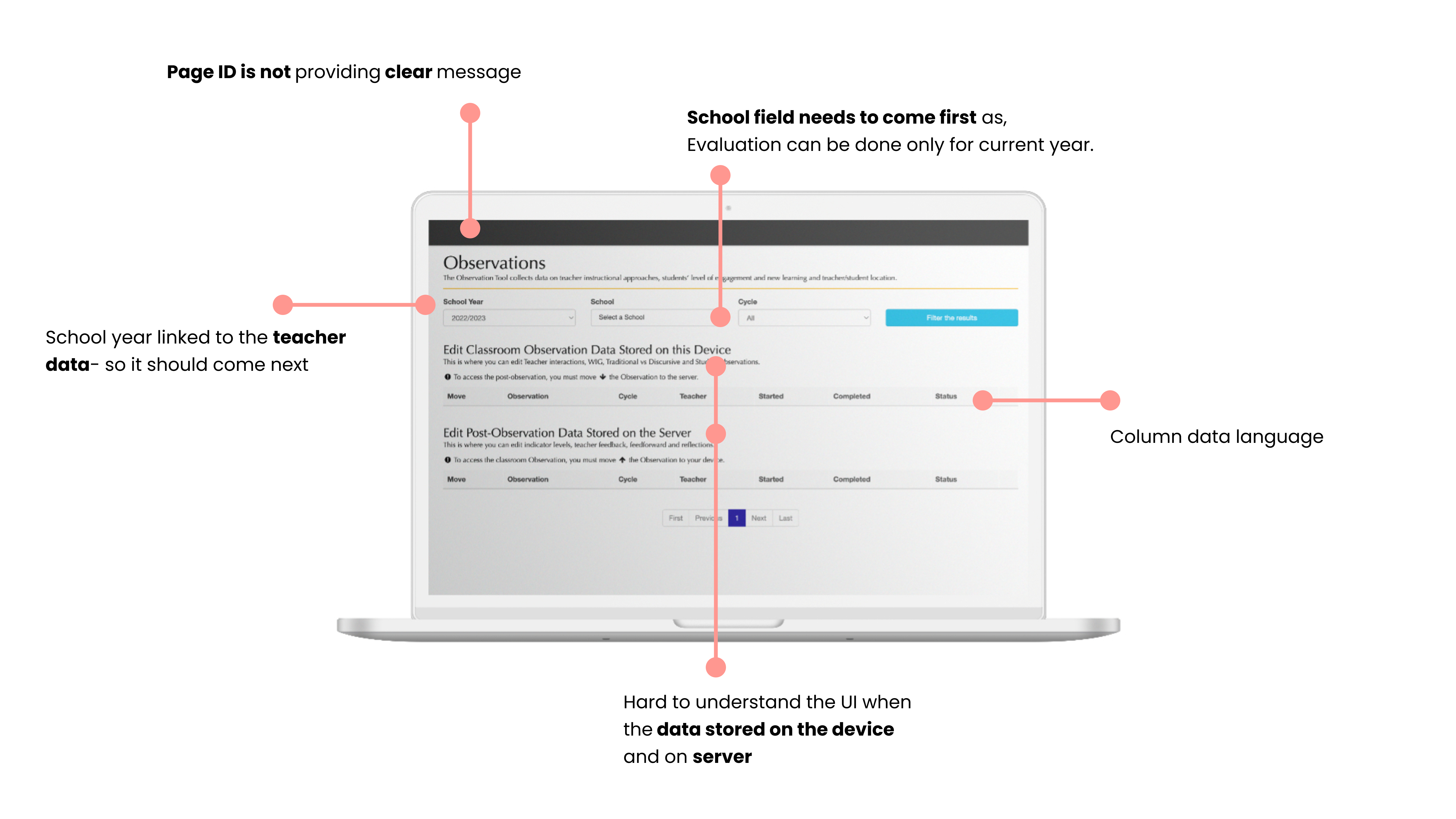
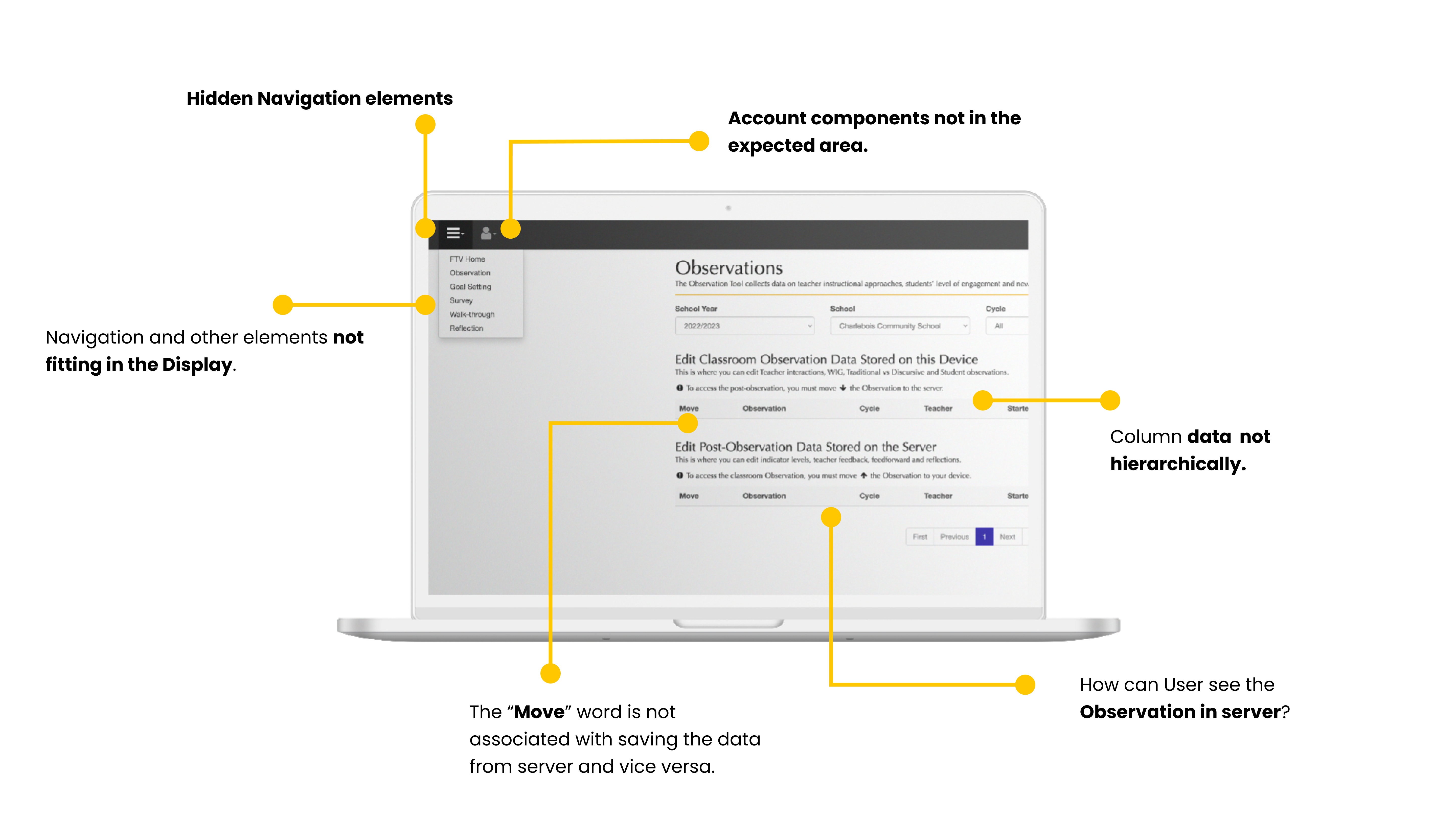
The observer don't know when data pushed to the server and when it is avaiable on the device.

Requirements on minimum logs

User does not know requirements on how much logs to add to teacher and student

What is timer trying to say?

Observation tool has a timer just for tracking time- but after 15 minutes it turns red, which is another frustration

Full Name

Lorem ipsum dolor sit amet, consectetur adipiscing elit.

How we can help you

Full Name

Lorem ipsum dolor sit amet, consectetur adipiscing elit.

How we can help you

Full Name

Lorem ipsum dolor sit amet, consectetur adipiscing elit.

How we can help you

Research Goal

User Interview

The user research goal is to understand the current evaluation process, identify the key user journey and find out pain points that evaluators are facing.

What is the workflow for the Observation process?

Demographics

8 users in a different roles supporting,
managing Teacher evaluation platform

Interview Insights

01

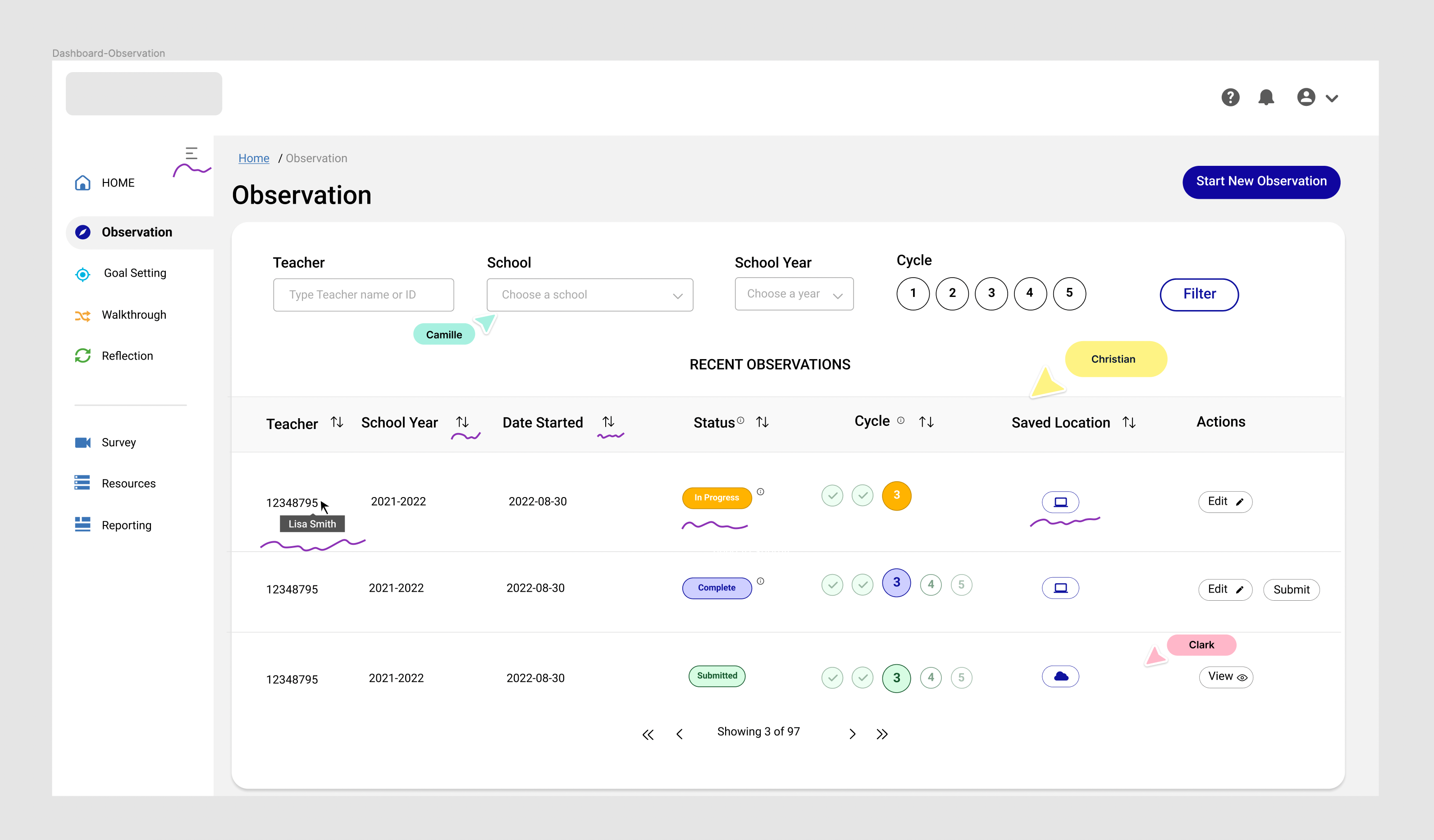
Teachers indicated by numbers, because of the privacy. Observer wants to see the teacher name- but still keep discreet from 1st accessibility.

02

Observers wants to find teacher by sorting one of these: by Cycle, cohort year, or by choosing a school

03

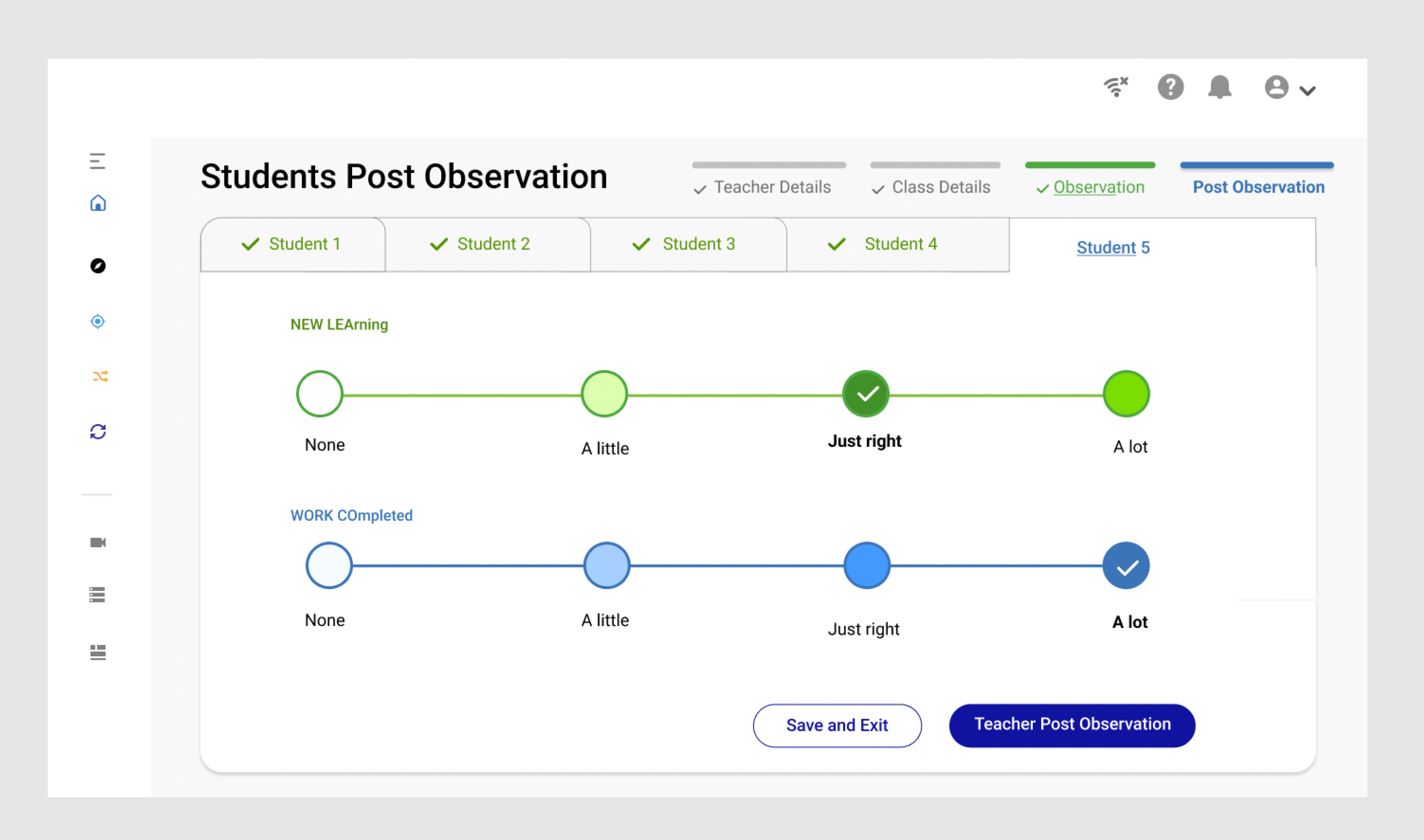
Observer wants to edit the comment she/he entered, delete or add new

04

Observer wants to Print the evaluation, submit completed one or save for later submission.

05

Observer wants to start Observation with less data entered

06

User wants to save and exit anytime during the Observation process

User Persona

RESEARCH

Sarah the Observer

Can view all Observations for the school which she is assigned to.

Theresa the Teacher

Can view only her part of the post-observation process. Can Login and add her required data

Bob the Administrator

Has an access to all data and permission to make any changes to submitted data

Full Name

Lorem ipsum dolor sit amet, consectetur adipiscing elit.

How we can help you

Full Name

Lorem ipsum dolor sit amet, consectetur adipiscing elit.

How we can help you

Full Name

Lorem ipsum dolor sit amet, consectetur adipiscing elit.

How we can help you

User Flow Chart (Observer)

RESEARCH

Epic User Story #1: As an Observer, I want to observe teacher and student in 1 session,
so I can keep 1 class observation together.

User Story #2: As an Observer I want to start observation by selecting 1 required data,
so all other fields can be auto-filled.

User Story #3: As an observer I want to evaluate by few aspects, so it will give a detailed information behavioural and attitudinal interactions with student

Key Solution Elements

RESEARCH

01

When user will hover on the teacher's number Name will be shown with a tooltip

04

We added action Print at the summary page, Delete or add new log can be done on each step of the process

02

We will implement the filtering by each components, so user by choosing 1 data can see the result

05

As the parent data is the teacher number: as per school and cycle is linked to each teacher - user can find a teacher with a name or last digit'd of ID number

03

User will be able to edit each log, and change each selected components if needs.

06

We will add "Save and Exit" CTA button on each step of the evaluation.

Full Name

Lorem ipsum dolor sit amet, consectetur adipiscing elit.

How we can help you

Full Name

Lorem ipsum dolor sit amet, consectetur adipiscing elit.

How we can help you

Full Name

Lorem ipsum dolor sit amet, consectetur adipiscing elit.

How we can help you

Information Architecture

DESIGN EXPLORATION

HMW
"How might we incorporate offline and online in UX design and make the transitioning from one another smoothly

Design Principles

UX PRINCIPLES

Hierarchy

Organizing the IA across the app was crucial. I employed a navigation menu, which showcases the main sections, as the primary hierarchy. This is the side menu that is visible when you initially open the app

Consistency builds a trust

Constantly confirming a user's assumptions about the next step helps establish a sense of control, familiarity, and reliability.

Accessibility

Design interfaces that are keyboard-navigable and use clear, simple language with tooltip explanations for data and icons. Enhance accessibility by utilizing effective color and contrast, ensuring visibility for all users, including those with visual impairments.

Full Name

Lorem ipsum dolor sit amet, consectetur adipiscing elit.

How we can help you

Full Name

Lorem ipsum dolor sit amet, consectetur adipiscing elit.

How we can help you

Full Name

Lorem ipsum dolor sit amet, consectetur adipiscing elit.

How we can help you

Bringing Product Solution

MID-AUGUST 2022

Design Rationale- P1
Online and Offline mode for the dashboard: Incorporated and showed with a clear messaging when Offline mode meets the Online. So user will be prepared about next step. AS shown on the Top Right navigation you can see Network disabled icon- when user is on the offline mode.

Steps of the observation Process: We suggest 4 steps to complete the Observation process. It starts from filling teachers details and other fields will be autofilled. Backend data structure shows that all other fields data linked to the Teacher, so putting the Teacher field first will provide less steps to complete the task.

Device and Observation components: Teachers use the Chromebook as a device. We had tight real estate and we need to use the 16:9 ratio display. No scrolling down, no hidden components on the screen. Location of the teacher, interaction type and attitudinal type of the interaction follwed by description were requirements.

LATE - AUGUST, 2022

Design Rationale-P2
Dashboard Navigation: Local Side- navigation is presented as a vertical link list and is placed below the top navigation, aligned along the left, forming an inverted-L shape. On the navigation All Components are visible and accessible all the time. Navigation is auto-collapsable when user start any of 5 tools. Can be collapsed manually when clicked on Taco menu.

Visibility of system status: Applied principle of visibility of system by showing the progress bar to  keep users informed about their actions and what’s happening at a given interaction and what is the next step. Checkmarks on the tabs to show the completion. And gradation likeable chart to show positions' levels.

Error prevention, recognition, and recover from errors: Designed CTA buttons on stages: disabled / greyout to show that user not ready for the next steps. By hovering on Disabled CTA button User we will see the solution, system will show required fields which need to be filled.

User Testing

8 Participants, 12 scenarios, Remote/Moderated

Each session 60 minutes.

Search for an Observation:
Participants asked to
searched for a specific Observation from the
Observation Tab on the Dashboard
Filter Results: Participants asked to find a specific Observation by filtering and sorting the list

Start Observation: Participants asked to Start new Observation session

User Testing Takeaways

Clean, Bright and intuitive UI

All Participants mentioned how UI and UX was improved and it was easy to navigate.

Confusion around Dropdown icon

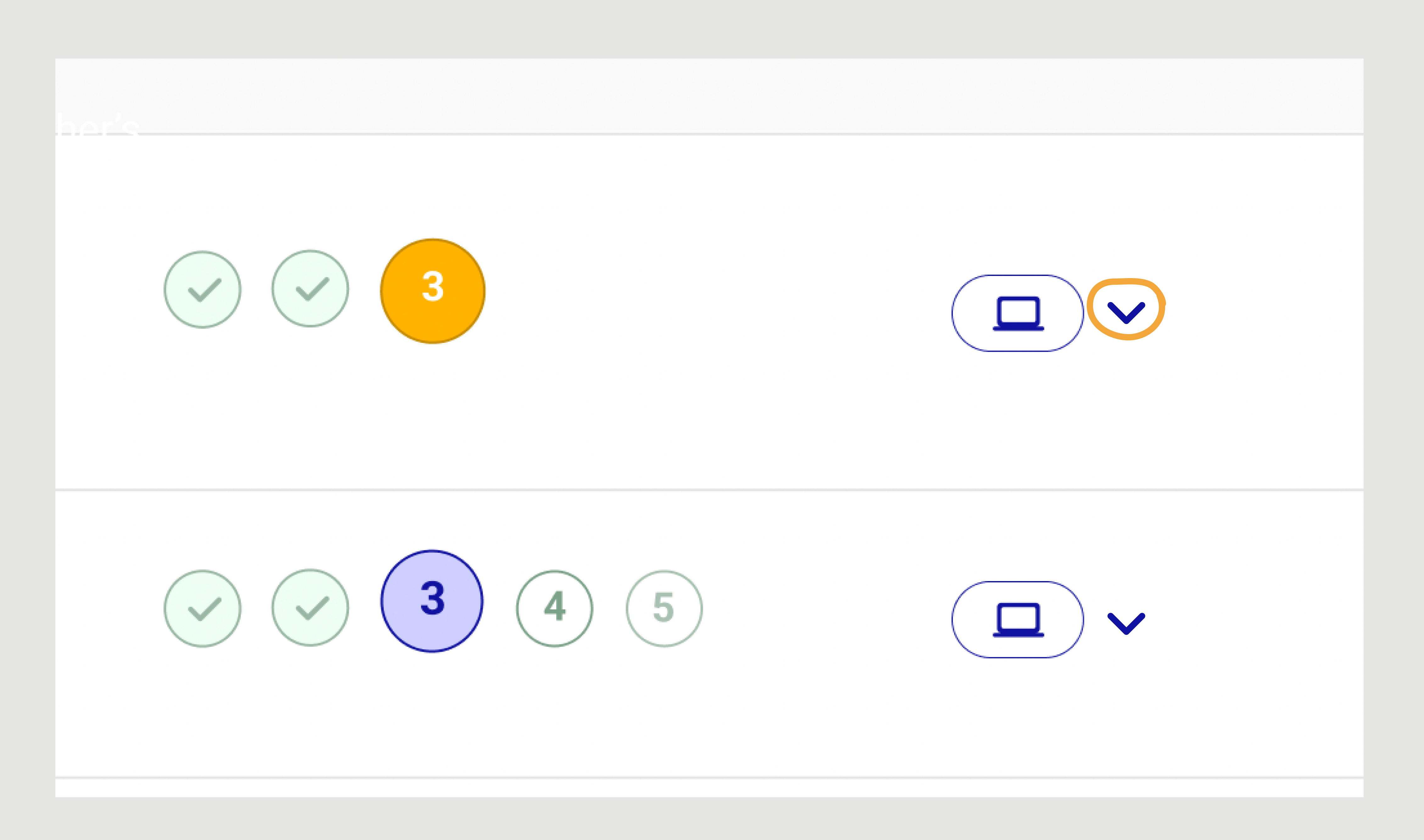
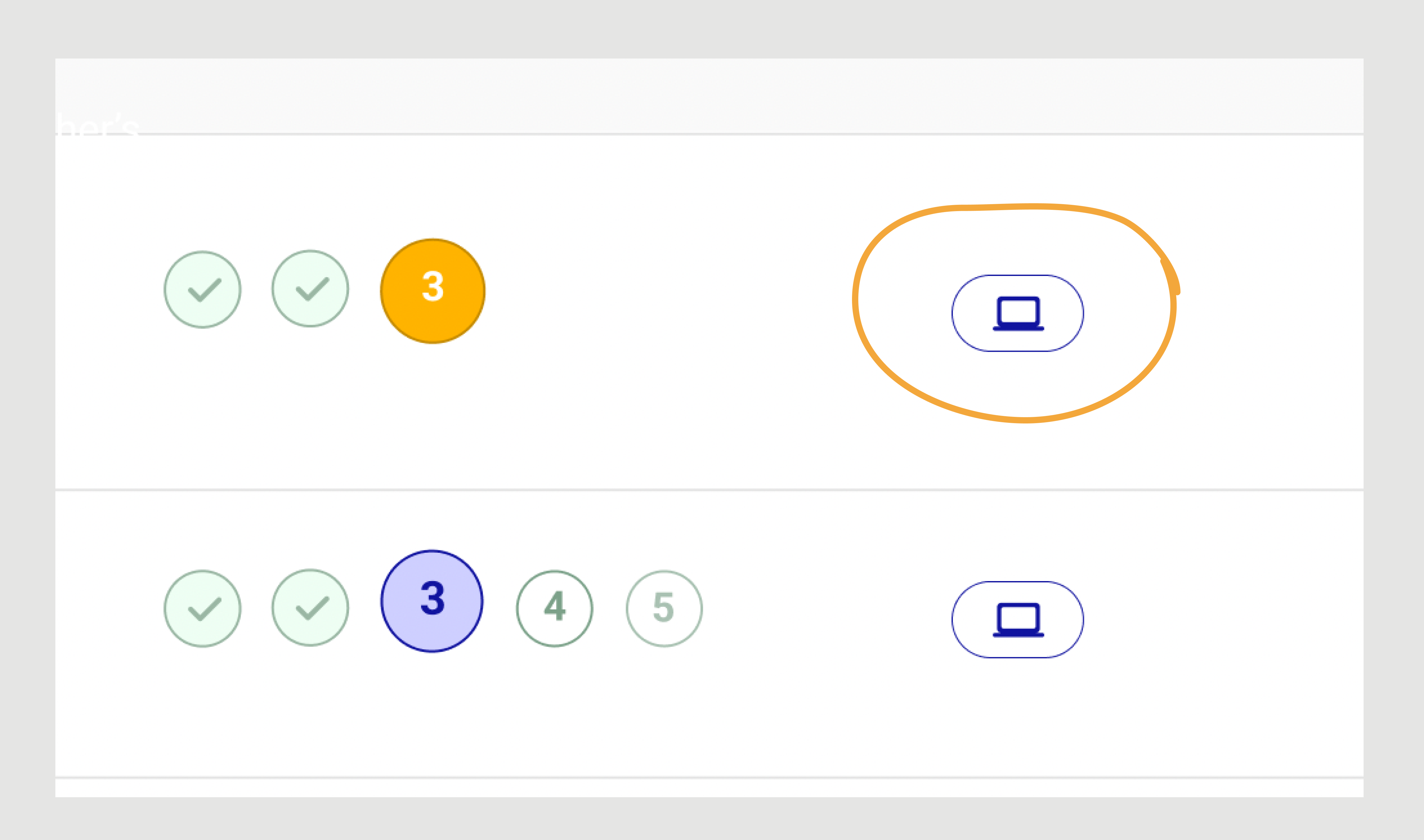
2 Participants could not know what the dropdown  icon means next to laptop.

Hide about the Students' logs

Participant A asked to hide the data entered, so student can not see it at Post-observation step.

Full Name

Lorem ipsum dolor sit amet, consectetur adipiscing elit.

How we can help you

Full Name

Lorem ipsum dolor sit amet, consectetur adipiscing elit.

How we can help you

Full Name

Lorem ipsum dolor sit amet, consectetur adipiscing elit.

How we can help you

Successful Task Completion: 8/8=1 x 100=75%. 8 out 8 testers successfully completed "Enter Teacher's Details" task, as the participants filtered the data and sorted the list.

Time on Task: 
This KPI was one of the important ones- as Observation has a timer. We tasked users to "Complete 2steps of the Observation: Teacher and Class Details". 8 Participants. Time on Task in seconds: 22, 15, 60, 24, 18, 31, 17, 45 (22+15+60+24+18+31+17+45)/7= 29. Result shows that it took 29 seconds on average to complete first 2 steps of the Observation. Which is 47 second faster than old one.

Error- Rate:
Start Observation task got 7(correct)/8(total participants) =0.875 x 8= 7% which great 7 out 8 participants completed task correctly.

Finally, we updated the wireframes with 2 feedbacks: Stored Icon and

Iterations ~ Updates

No dropdown icon anymore

Dropdown showed the locations list of the Observation: Server or Laptop. And user could push the Observation to the server or vice versa. Read the new solution...next box

Added Submit button

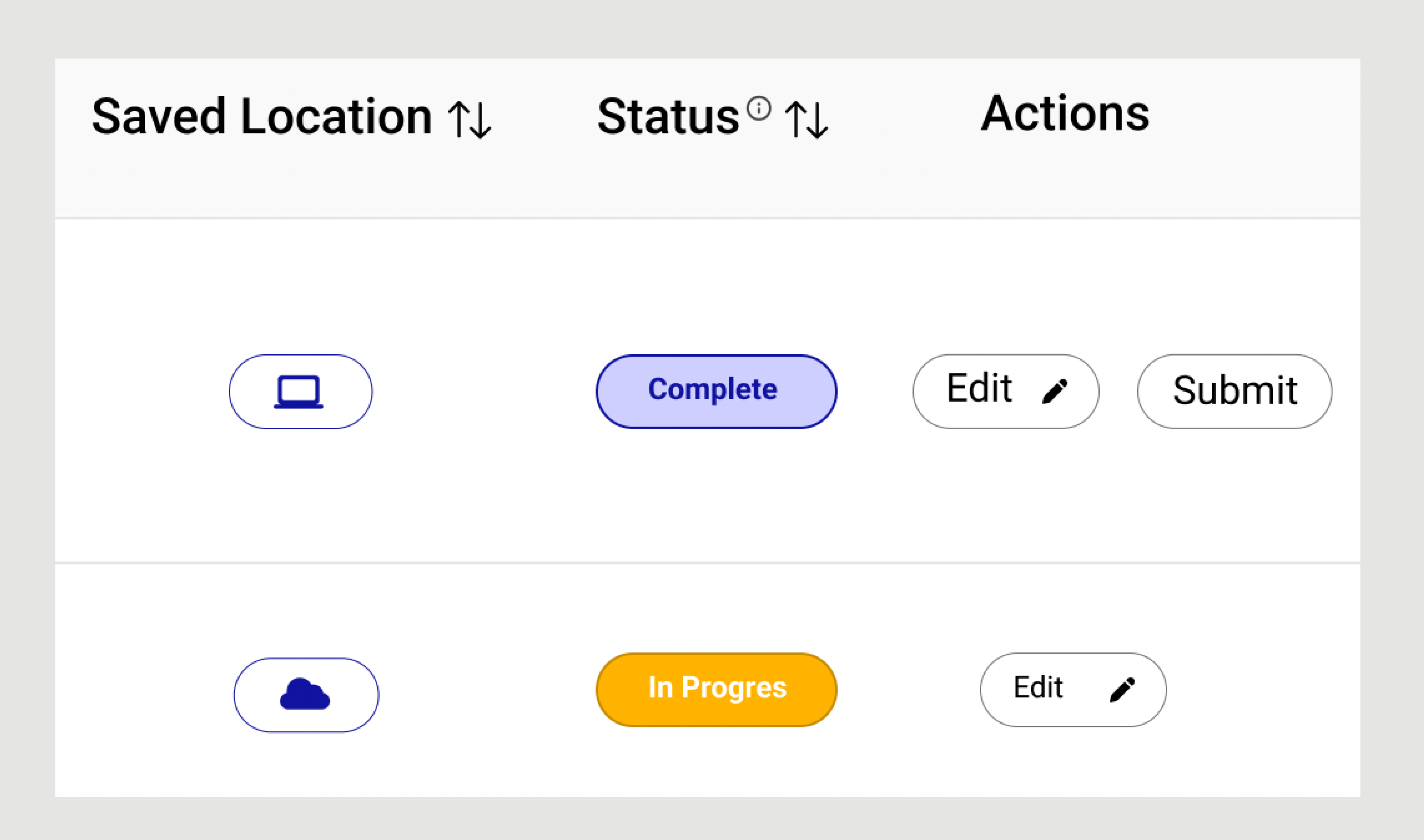
Instead of dropdown icon, we discussed with Developer, and brought a solution to add Submit action, which will Save the Observation on Server. User will get a Confirmation message that Observation was Submitted.

Hidden Students' logs on Post Observation

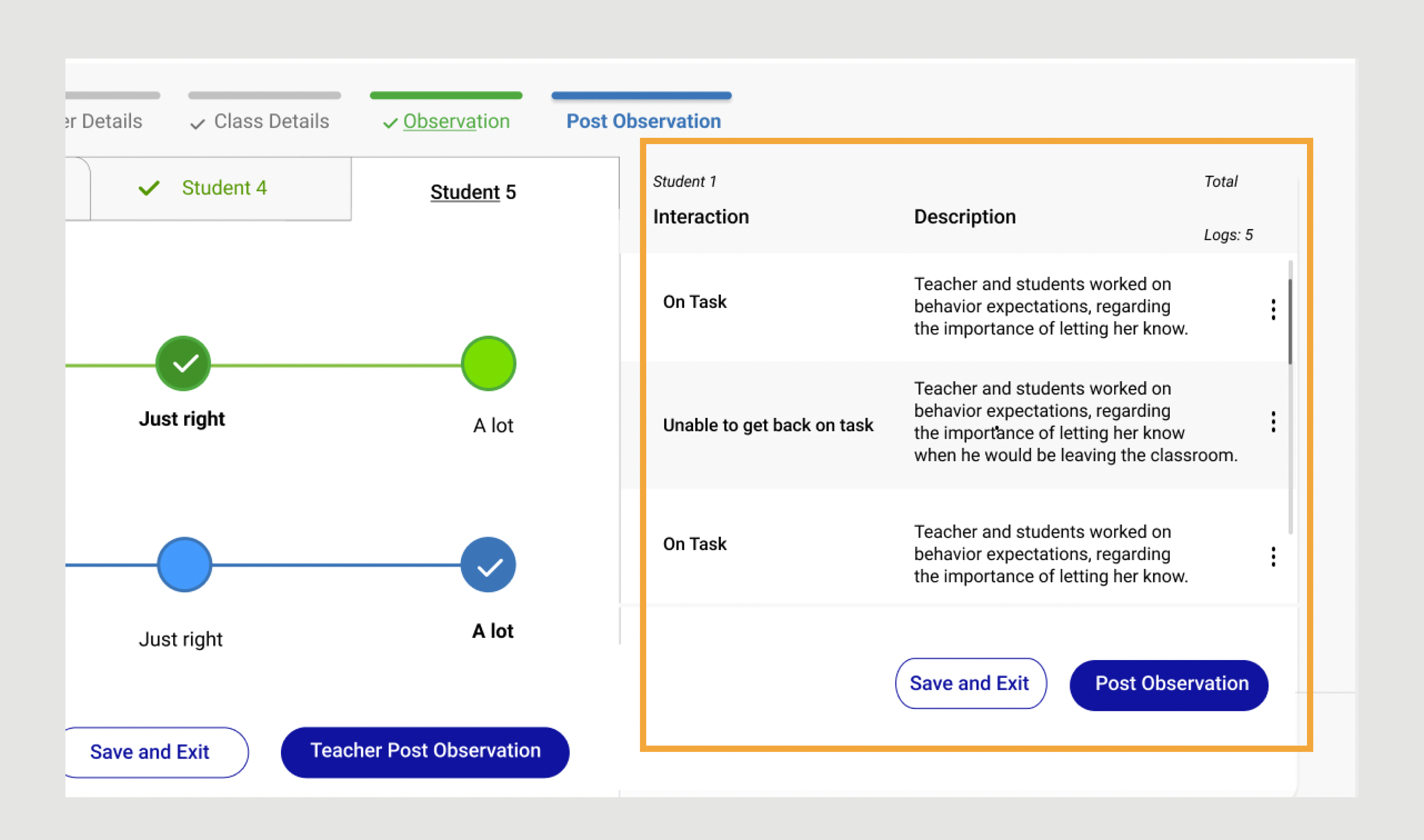
As 1 participant Observer, mentioned about privacy of the data, Stakeholders supported this change and we hide the logs on this page. But all entrees are stored on the database.
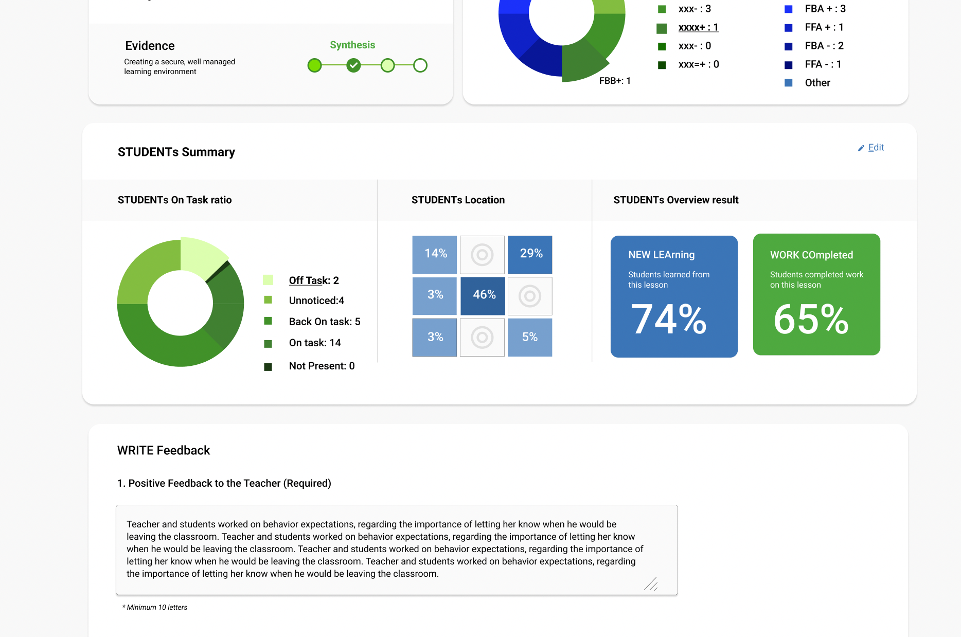
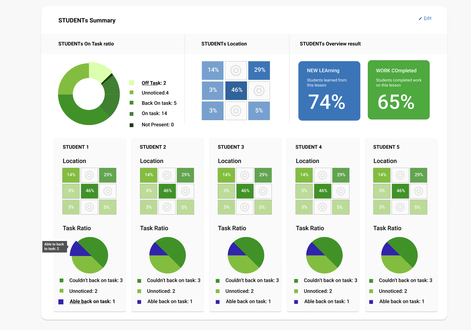
Full Name

Lorem ipsum dolor sit amet, consectetur adipiscing elit.

How we can help you

Full Name

Lorem ipsum dolor sit amet, consectetur adipiscing elit.

How we can help you

Full Name

Lorem ipsum dolor sit amet, consectetur adipiscing elit.

How we can help you

Handoff

I collaborated closely with the engineering team to confirm the implementation of the design and copy. In addition to daily stand-up meetings, we held weekly demonstrations and periodically sat down together to review and compare the implementation with the final designs.

THE RESULT

Business Impact

Improved UX

A intuitive UI of the new platform lead to improved user satisfaction and reduced time on task by 46%.

Increased Efficiency

Streamlined design is allowing Observers to complete observation or any other tools in this platform quickly and efficiently

Enhanced Data Quality

Reduce the risk of errors and improve the accuracy of evaluation data.

Full Name

Lorem ipsum dolor sit amet, consectetur adipiscing elit.

How we can help you

Full Name

Lorem ipsum dolor sit amet, consectetur adipiscing elit.

How we can help you

Full Name

Lorem ipsum dolor sit amet, consectetur adipiscing elit.

How we can help you